

The Things You Can Do With Pictures
The Things You Can Do With Pictures
In which I mostly talk about a use of pictures in astronomy

(A little while ago, Bryan Formhals told me that he’d be interested in me writing about astronomy. I thought that if something interesting pops up, I might just give it a try — as long as I can tie it to photography. So here we go.)
Before I entered the field of photography, I was working in astrophysics. I received a doctorate in physics in 1999, having spent three years running and analyzing parallel-supercomputer simulations of cosmological models. When I entered the field, the Dark-Matter paradigm had been fully established, but there still were questions about its amount: how much of it is present in the Universe? Right at the end of my doctorate, evidence of the presence of what ended up being called Dark Energy emerged.
The idea behind simulations was and still is simple: you simulate a large volume of a fictional cosmos that is intended to be mimmic ours as closely as possible, and you then compare it with what you observe using statistical tools. For example, the simulated volume might contain a large number of galaxy clusters. Their overall properties (such as, let’s say, the way the mass is distributed inside them) ought to be comparable with what you observe in real life. If it’s not then that means your underlying model is wrong, and you need to fix it (which inevitably means running more simulations).
I had to think of all of that the other day when I came across a news article that said that new observations indicated that current models are not correct. I still follow what’s going on in astronomy, albeit through what filters into the news. In most cases, I will then make my way to the actual scientific articles. I still remember enough to be able to read those articles (but of course, I don’t understand all of the details any longer).
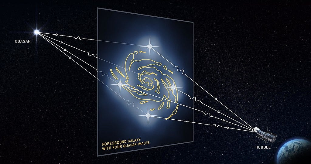
(Illustration by NASA, ESA and D. Player (STScI) — source)
The news article I read focused on gravitational lensing. I thought this might interest you because it’s an area of cosmology that uses photography. In a nutshell, a gravitational lens works “just” like an optical lens, the only difference being that it’s the presence of a large amount of matter that changes the path of light (see the illustration above) — instead of a piece of glass or plastic (like in your camera). While the details are of course more complex (it’s based on General Relativity), that’s all you need to know.
(source)
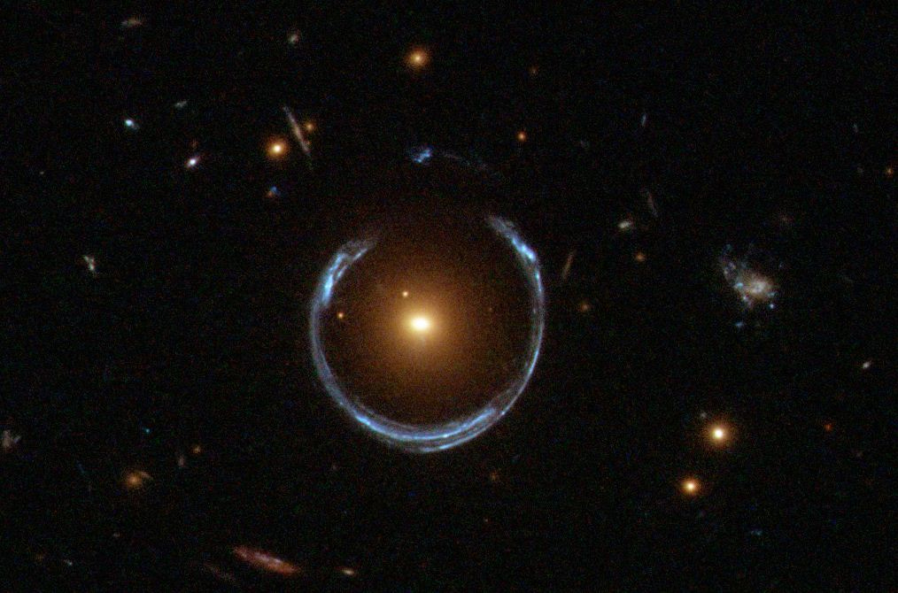
If you have a very massive object right in between you and some far-away object (a galaxy or quasar), then you will be able to see an optical effect. The picture above is an actual (astronomical) photograph, and it shows what’s known as an Einstein ring.
Note the colours. They’re real, and they tell us something about the objects. The bright orange-yellow spot in the center is a luminous red galaxy (LRG; not hard to guess why it’s named that way). And that almost perfect ring around it is actually an image of a galaxy that lies behind it, at a much larger distance. The LRG’s gravitational lens distorts that image’s galaxy into an almost perfect ring. It would be a perfect ring if everything were perfectly aligned, but things are just a tad off. The ring is blueish white because that galaxy is blueish white. In a nutshell, red galaxies are red because they only contain old stars (which are red [yellowish]), whereas blue galaxies are blue because their light is dominated by young bright stars (which are blue[ish white]).
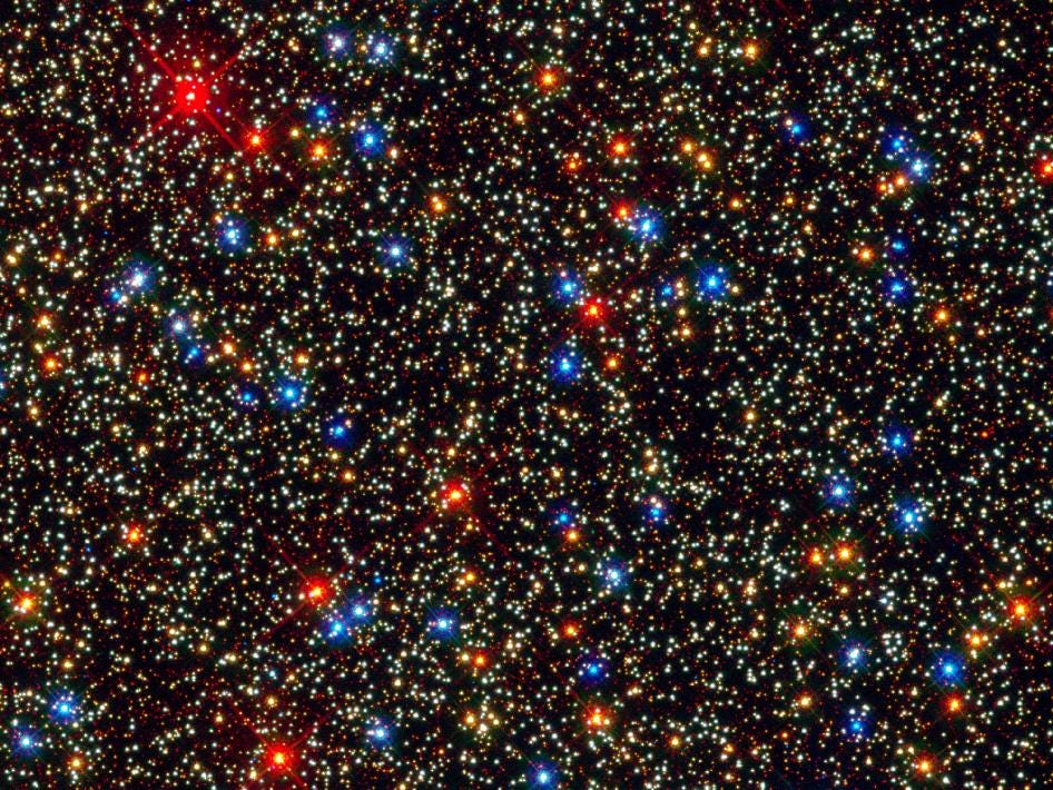
(Image: NASA, ESA, and the Hubble SM4 ERO Team; source)
This image shows the interior of the globular cluster Omega Centauri (a globular cluster is a spherical accumulation of a huge number of stars). As you can see, its stars have different colours, based on what kind of star they are. Without going into the details, the colour is related to a star’s surface temperature — and you know those numbers from photography! When you colour-balance an image based on the ambient light source, the “colour temperature” of your light source is the temperature of a star that would have that colour. It’s basic physics, and it applies to astronomy as much as to photography. (I’m simplifying this a bit. I should really talk about black-body radiation. But the basic principle behind this is all you need to know.)
Back to gravitational lensing. Given the effect, astronomers know that there must be a lot more matter present than what’s visible. With just the mass of its stars and gas, a galaxy couldn’t produce what you observe: the gravitational potential would be too weak. There is a halo of Dark Matter in which the galaxy is embedded (astronomers call these objects haloes — you can just think of them as roundish blobs that are larger than the objects they contain and that might be connected to the material around them with filamentary links). Thus, gravitational lensing is an important tool to measure the Dark Matter that surrounds objects like galaxy clusters. And it really is the Dark Matter that accounts for the lens itself: there’s a lot more Dark Matter than visible matter. So much like in your camera (or eye glasses), the lens in itself is invisible.
Knowing that, if you look at these kinds of picture, you’re now seeing more information than before. You’re probably seeing the different colours, you immediately know something about their ages, and you indirectly see the Dark Matter. Here’s a another example:
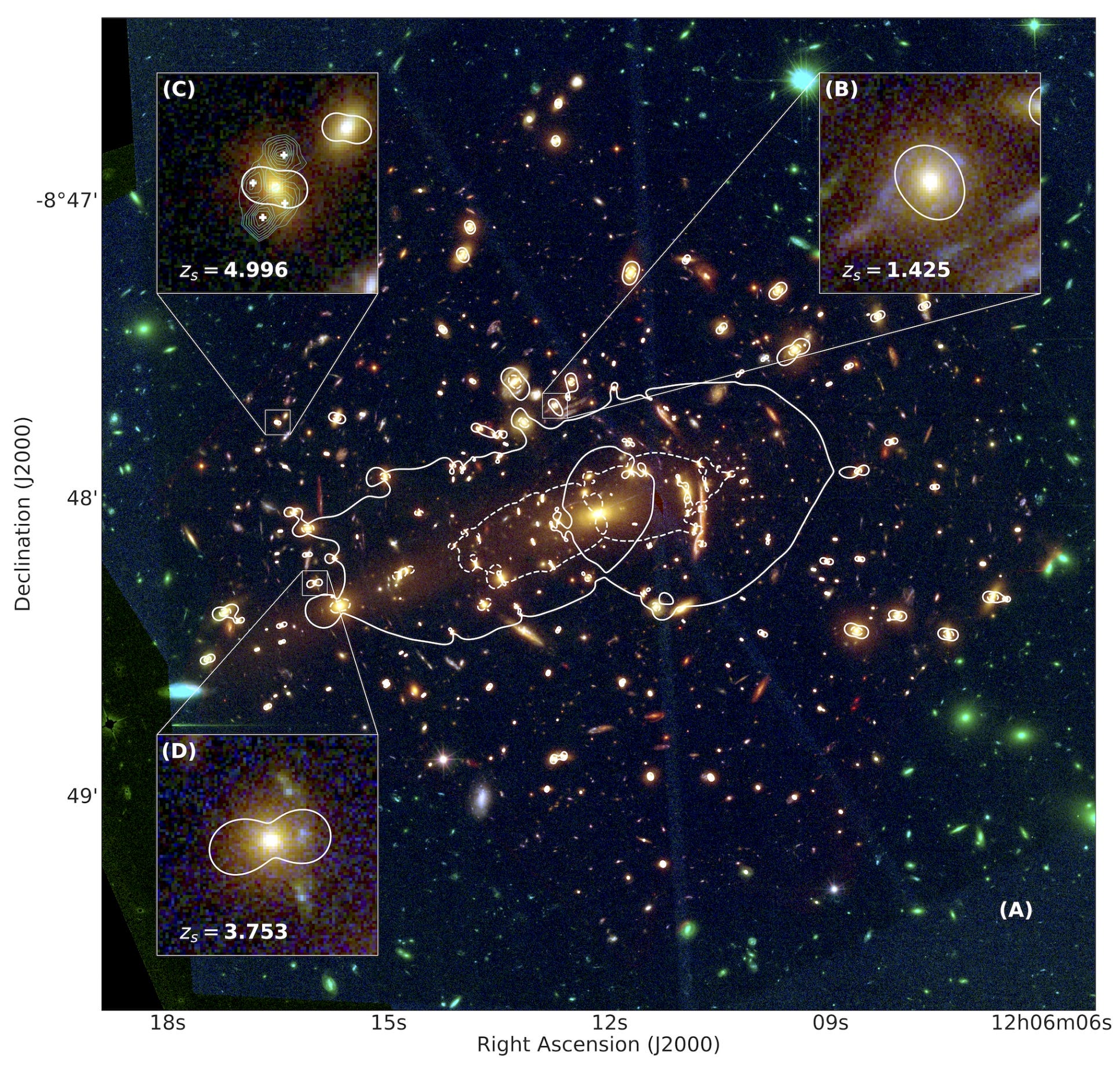
(image from: Massimo Meneghetti et al. — An excess of small-scale gravitational lenses observed in galaxy clusters, Science; you can read the full paper here)
This picture looks a lot more complicated, but it’s still the same principle at play. There’s just a lot more going on. This is an image of a galaxy cluster, which is acting as a gravitational lens for objects in the background. Essentially, there are two types of lensing effects, one caused by the cluster itself and one caused by individual galaxies. The three boxes labeled (B), (C), and (D) show lensing by three select galaxies in the cluster (note the differences in the colours in some of these objects — it’s just the same as above; also note that zoomed in, the telescope has noise — just like your camera).
Those lines that have been added in white show the locations of what cosmologists call critical lines. There’s no need to go into the details. All you need to know is that critical lines depend on the cluster’s mass and its distribution. You could think of the distribution as the shape and thickness of the lens — just like how in eye glasses, lenses also have rather complicated shapes, depending on a variety of factors (this is especially true if you need a strong prescription and if, like me, you also need to correct for the effect of your age).
If you want to compare this observation with a simulation, you wouldn’t have a simulated cluster that looks exactly like the one you observed. But you would have a cluster with the same mass and maybe roughly the same shape. So you can compare the properties of these two objects — one real, one simulated — statistically.
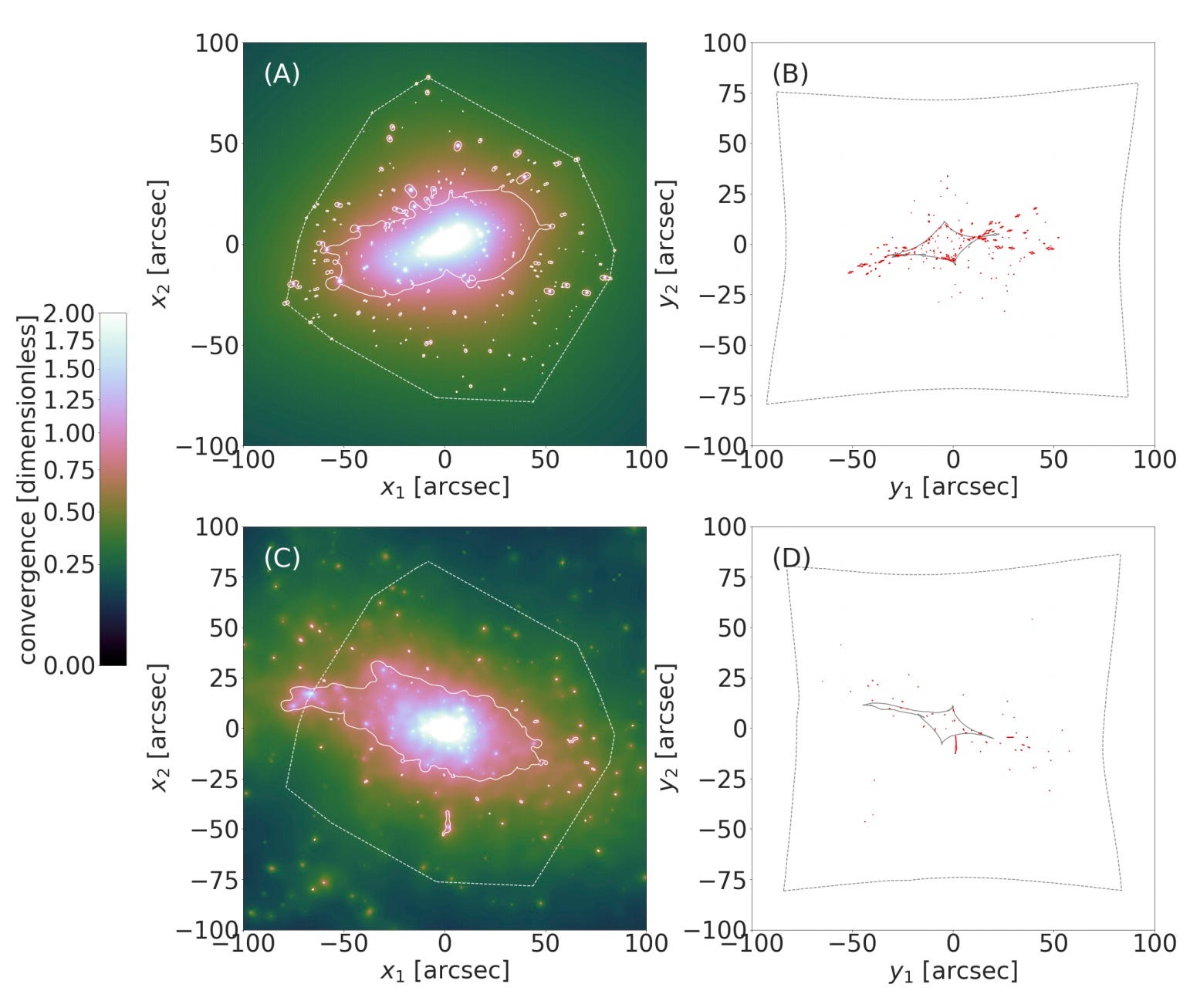
(image from: Massimo Meneghetti et al. — An excess of small-scale gravitational lenses observed in galaxy clusters, Science; you can read the full paper here)
This is done in this Figure. The top row is the observed cluster, the bottom row is from a simulation. There now are different colours because you’re looking at different things (properties of the gravitational lens; astronomers play the game of changing colours all the time). The only thing you need to take away from this picture is that in the top left panel you have a lot more of those little dots around the central blob than in the bottom left panel. Leave it to the astronomers to quantify this, but you can see it.
The difference in the number of little dots is the key to their claim that the simulation is missing something. Those little dots correspond to individual galaxies acting like a lens (you saw three of those in the other picture). There are more individual galaxies acting like lenses in the observations than in the simulations. This means that the model used for the simulation does not produce enough mass around individual galaxies.
This might sound like some small detail, but it’s actually a huge deal. If there’s not enough mass around what in simulations are galaxies, then in such a universe galaxies would probably be very different. They might have less stars or very different stars: in all likelihood, in such a universe we would not exist. Now the simulation crowd will have to go back to their drawing boards and improve their simulations. Or maybe there already is a simulation that reproduces what is observed, and someone else will write an article and point this out. Either way, this is the kind of game played in cosmology. Large parts of it depends on sophisticated computer simulations, and actual pictures play a large role.
Above, I mentioned colour corrections in photography. This is one of the most important aspects of colour photography. In fact, it’s so important that many types of software will do the job for you, in particular the software that operates the camera(s) in your smartphone.
This is all very good, until the software does the job in a way that you don’t want it to do. That’s what happened to many people in the (US) American West who tried to photograph their daily surroundings that were shrouded in smoke and ash from wildfires:
“Certain photographs and videos of the surreal, orange sky seemed to wash it out, as if to erase the danger. […] The photos looked vaguely marigold in hue, but not too different from a misty sunrise in a city prone to fog. In some cases, the scene seemed to revert to a neutral gray, as if the smartphones that captured the pictures were engaged in a conspiracy to silence this latest cataclysm.”
This is a quote from an article by Ian Bogost in Atlantic magazine. He writes “The un-oranged images were caused by one of the most basic features of digital cameras, their ability to infer what color is in an image based on the lighting conditions in which it is taken. Like the people looking up at it, the software never expected the sky to be bathed in orange.” In other words, the phones wanted to produce good pictures with accurate colours, but they didn’t realize that what they thought of as a fake colour — that huge orange glow — was actually real. How crazy is that?!
This poses an interesting problem for the developers of such software: how do you account for the fact that sometimes, people do not want their pictures to be colour corrected? Or rather how do you teach your software that what looks like an image that is in dire need of colour correction is actually the correct picture?
Lastly, in my previous email I shared a link to an article that dealt with a recent incident involving the New York Times and photographers Tonika Johnson and Alec Soth. After I shared it, the article was updated not just once but twice. I learned of the first update on Twitter, and I don’t think the second one was even announced.
I would have never shared the original article, if I had known how sloppily it had put together and especially how massively it distorted Soth’s side of the story. That’s completely unacceptable. On his Instagram, Soth took the writer to task for his failure to do a proper job — have a look (if you haven’t seen it already).
I already check articles I share against other articles or against other information I have. Still, in this case that wasn’t good enough, and I deeply regret having shared that particular article.
And now I’m going to get back to website coding. Ever since the software I used on my own website died (jmcolberg.com — don’t go there, yet, it’s blank), I had let it lie dormant. But now I have work to share (photography, a book, and more). The last time I set up my own website was something like 10 years ago, and a lot has changed. It turns out I hate coding just as much as I did back when I did it last. Regardless, I found a template I can work with, and I’m slowly making my way towards having a website with my own photography again.
I hope this email finds you well and healthy. With wildfires out West, a storm hitting the Gulf Coast, a pandemic still raging, it feels a bit as if Nature isn’t happy with us any longer. At times, I find it very hard to keep smiling — or at least not to give in to despair. Let’s just all hope that there are better times ahead.
As always thank you for reading!
— Jörg
I’m a freelance writer, photographer, and educator currently living and working in the US.
This Mailing List is my attempt to bring back some of the aspects that made early blogging so great -- community engagement and a more relaxed and maybe less polished approach to writing and thinking about photography. You can find the bulk of my main writing on CPhMag.com.
If you like what you read and would like to support my work, you can. Large parts of my work are fueled by black and green tea, and I appreciate your support very much!
You can also support me by liking this email, by sharing it with others, and/or by emailing me back to tell me what you think. I'd love to hear from you!