

The Mailing List Takes Shape
The Mailing List Takes Shape
In which I talk about: what happened on CPhMag.com, a blistering review of Pieter Hugo's latest exhibition, why I'm now using Futura even though a book's title told me not to, and a little print sale

Much to my delight, my first email resulted in some direct responses. As critical as I am of what I produce (I barely ever re-read anything I already published), this has me hopeful that the idea of this Mailing List might work out after all. I probably need to work on a few formatting details (maybe more pictures), but I’m hopefully, I will figure this out.
On CPhMag.com…
Ultimately, this Mailing List is supposed to replace most of my activities on social media, in particular Twitter, so I might as well get started by talking about what happened on my site since I sent out the first email. There’s more to than just spreading the word, though, because I like the idea of talking a bit about what went into these articles. If you’ve already read them, or if you’re not interested in anything “behind the scenes”, simply scroll down…
My new feature In Hindsight is something that I should have started a long time ago. While I love writing about photobooks, I have come to be somewhat resentful of the whole review idea. I like writing reviews of books that have just been published. But I mind the idea that the review is part of the whole production, meaning that a book gets talked about in this relatively short window between it being published and Listmas (when everybody writes about their buddies’ books… no, wait, I meant books they enjoyed so much the past year). I feel that this cheapens both books and especially the value of reviews. Maybe you don’t feel that way. But as someone who writes reviews if my job is merely to provide some extra PR (however deserving it might be), then that’s not really what I think criticism ought to be (also, I don’t like the idea of providing free PR). Thus, the idea of In Hindsight was born: the idea being that I would write about any book that has been published already and that is not one of the small number of books that get written about all the time (think: The Americans — how infinitely boring!).
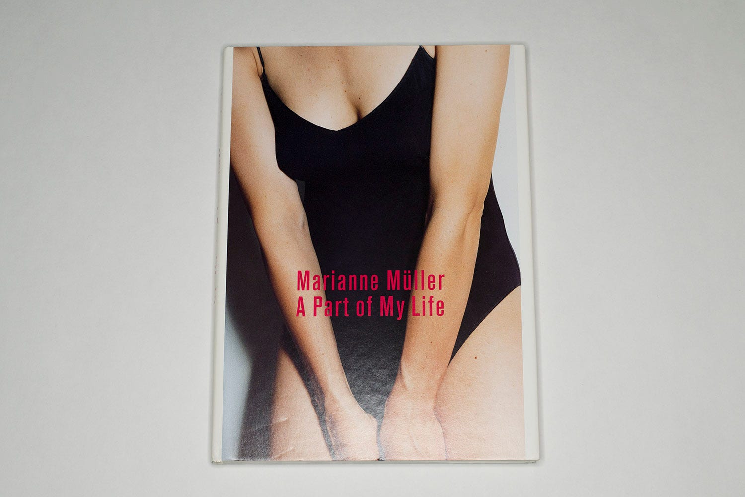
I started off with Marianne Müller’s A Part of My Life, a book that I think deserves to be seen and talked about a lot more widely than it currently appears to be. Much like Abigail Heyman’s Growing Up Female (which might be subject of a future article), the book was a chance discovery. I basically paid the same amount of money for both books — Heyman’s book came from a local second-hand book shop, Müller’s I bought online (when I found Growing Up Female, following the logic of the marketplace I found that I had actually overpaid my local bookseller, given that there were softcover copies on Amazon for 75 cents [I’m not making this up]). In both cases, I was shocked that I had never heard of the books before, and I was shocked that they would sell for roughly the price of a cup of coffee while a lot less deserving books were valued a lot more highly. In both cases, I was also absolutely entranced by the quality of both the photography and the way it had been turned into a photobook. The sequencing (and storytelling) in both books is absolutely brilliant. While Heyman’s book betrays the time when it was made (the topic itself obviously is just as relevant today), Müller’s doesn’t. The photographs still looks fresh, and it lacks the self-aware slickness that I see in a lot of work these days.
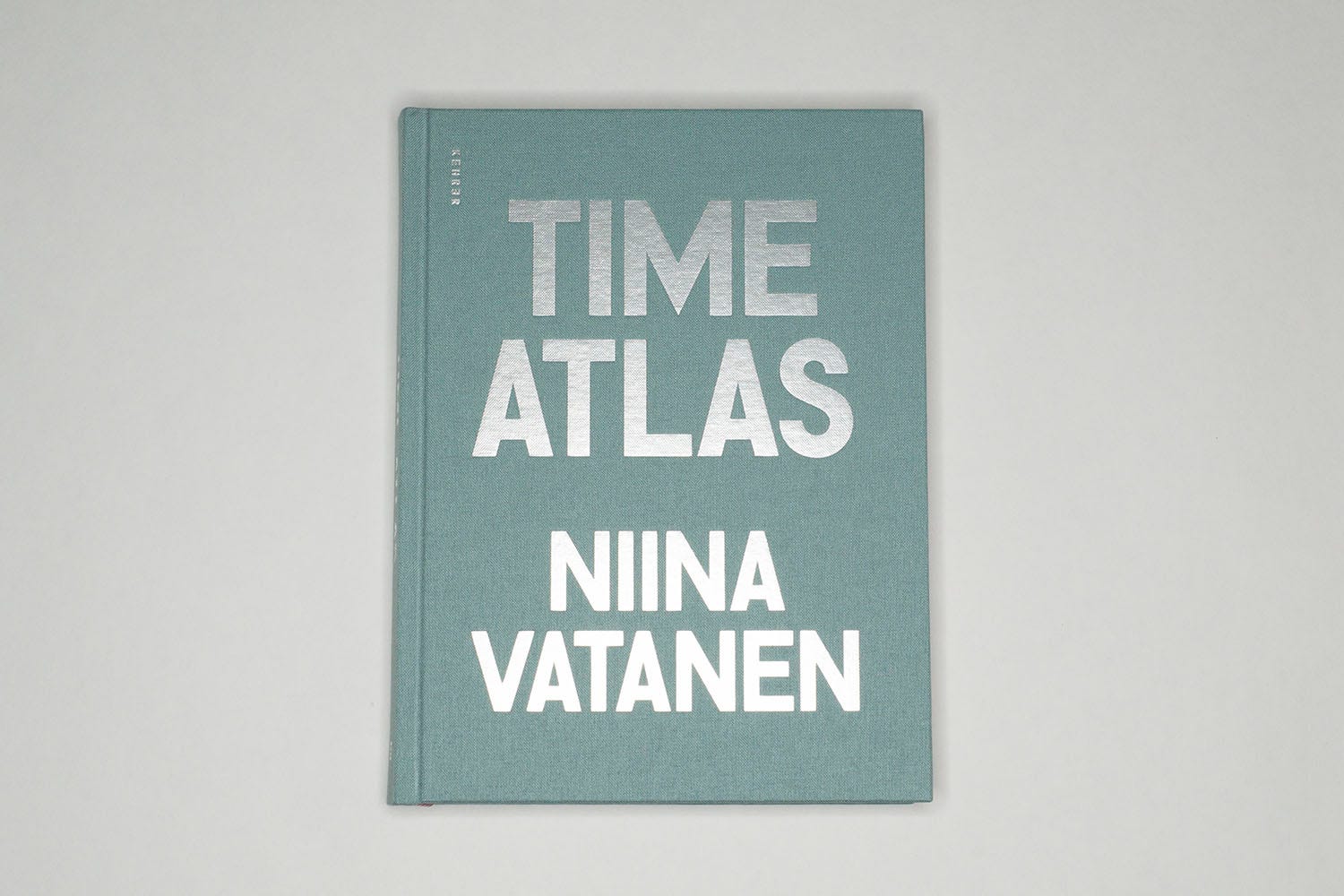
The week after (if you’re reading this email shortly after it arrived: this week), I went back to the older regular programming, reviewing a book by Finnish artist Niina Vatanen (you find find the review here). You might not realize this when reading an article (or maybe you do, and nobody has ever told me), but I struggle the most with writing, when I think beforehand that the job at hand is obvious and simple. I did like the book, and I thought it would be straightforward to write a review. But then I caught myself worrying about repeating myself. Some repetition cannot be avoided, since there are only so many aspects covered by photography and photobooks. Still, I don’t want to repeat myself, because I don’t want to be like those people you meet whose repertoire consists of ten stories, and inevitably, you’re going to hear all or a significant fraction of these stories every time you run into them.
(As an aside, this is also an issue when I’m teaching — for obvious reasons, there has to be a lot of repetition when teaching. But from my past experience as a student I know how much I hated teachers who’d just let the internal tape run, without bringing any excitement to their delivery. So for pretty much every class that I taught before I make a lot of changes to keep the material fresh and relevant, forcing myself to re-engage with the task at hand. This is a bit of work, but it also has me learn new things all the time.)
So in the review at hand, I ended up talking about two aspects of photography that have been driving me crazy, namely first, the fact that everything always has to be resolved and second, that photoland as a whole is so devoid of humour. These two aspects are relevant for me when looking at this book, because I do enjoy its wit quite a bit, and I’m tickled by its internal logic.
The audacity of Pieter Hugo
“One has to admire, if grudgingly,” writes Richard B. Woodward in a review of the photographer’s latest exhibition at Yossi Milo Gallery, “the audacity of Pieter Hugo.” If you have not read the piece, you might want to do so now before continuing here.
I’ll admit that I hadn’t paid much attention to this particular exhibition. I am on the gallery’s mailing list but mostly to see what kind of photography is currently selling well in New York. Hugo has been showing work with Milo for a long time, and I’m no fan of this photographer’s output. Technically a very gifted artist (but really, what does that mean anyway?), I find Hugo’s work mostly shallow and often offensive. Of course, there’s good offensive (work that forcefully challenges one’s beliefs) and bad offensive. Here, it’s really just bad offensive.
Woodward makes a good case for how and why the particular photographs in question are offensive:
The photographs in the show are calculating and feel like the clichés of a tourist drawn to the sensational. Whether the result of his limited experience with life in Mexico—they were made on just four trips over two years, to Hermosillo, Oaxaca de Juárez and Juchitán—or from an ingrained appetite for voyeuristic content is hard to say.
Just a little earlier, he writes:
It’s as though he were inviting charges of exploitation so that in defense he might portray himself as a victim of political correctness.
Woodward’s shooting down of the political-correctness defense (which is very commonly coming from the right and especially far-right spectrum, but which I have also seen in the context of discussions around art coming from people who consider themselves to the left of those groups) is a good strategy.
I’m not sure I agree with parts of Woodward’s final paragraph — for example, I personally find it very simple to dismiss Hugo’s photograph of hyenas and their owners, given that they perpetuate the worst colonial stereotypes about Africa. I also don’t think Diane Arbus needs to be the go-to yardstick for criticism whenever there are portraits of “outcast subjects”, even though I endorse Woodward’s sentiments towards Avedon’s photography in the American West (the latter a position that I have come to over the years, after initially being enthralled by the work).
To be honest, I often stay away from writing about work such as Hugo’s. This is not because it’s so bad or problematic, and it’s not because I’m somehow worried I might ruffle some feathers. It’s simply because it literally pains me to sit down and spend time writing about photographs that are so unbelievably bad in so many ways. What’s more, naive me thinks that it ought to be very obvious for anyone — other than those rich collectors maybe who’ll pay $24k per picture (seriously, wrap your head around that!) — how bad and problematic the work is. In other words, I really don’t like shooting fish in a barrel.
But the reality, of course, is that it’s sadly not that, because if either Hugo, or the gallerist, or the collectors would be aware of how problematic the work is, then I want to think they wouldn’t make, sell, or buy it. My assumption here obviously is that any of these people aren’t Steve Mnuchin types, which might or might not be a good assumption. To wit:

Having read the review, I was wondering what my friend Carolina Miranda, a staff writer for the Los Angeles Times, would think about it. In the fall of 2019, Carolina had visited Northampton, and we had enjoyed a joint outing to MASS MoCA, where we saw some work made my Mexican artists (who, I will admit, I had not known before). Here’s her reaction on Twitter:

In a follow-up tweet, she clarified she had Graciela Iturbide in mind. I hadn’t necessarily thought of that while reading the review, even though I had rolled my eyes seeing the mention of the usual suspects (Avedon, Arbus, also Gilden). In my own reviews, I tend to go back and forth with such comparisons; but in an obvious way, especially in this particular context, this is indeed, as Carolina writes, a spectacular oversight. After all, to overcome parts of the problems posed by Hugo’s work means to expand our vision of the world, to, in other words, not just become aware of what’s wrong with some pictures and why but also to have counterexamples to see how something can be done properly.
So this ended up being the big take away for me from the whole affair: it is extremely necessary to have those counterexamples, especially if they’re provided by artists from the area in question. It’s easy to criticize Hugo, but to do it well, one does need to move towards a counter vision as well.
Never Use Futura
Over the past six months, I have been working on my first photobook. In some capacity, I have been involved in photobook making in the past; being the photographer is a new experience, though. Having looked at many photobooks, I appreciate attention to detail, and I decided I would attempt to follow such an approach. I know I'm no designer, and I'm not going to attempt to design the book. But a few details I thought I should pre-determine, including the cover's colour and the type(s) (font(s)) being used.
Given the book centers on the echos of Germany's Nazi past (and its present reincarnations), my first font choice for the title was based on what I had seen at Berlin's Potsdamer Platz subway station. After a little research online I found something very close to what I had been looking for (I also learned that Berlin's subway system features a large variety of fonts, which is a really interesting story on its own), resulting in:

I liked the way that looked. I started showing a pdf of the book to a small number of people. A German friend of mine told me that he thought that looked too much like German band Rammstein's use of typography. For sure, that's not what I wanted. So I needed something different.
Thinking about it, the Potsdam font used above also anchored the title in the past, whereas I wanted something that would have echos of both the past and the present (much like the photographs themselves). Which font, I asked around online, was created in the 1920s or 1930s and clearly referenced that era but was still in use today to look somewhat contemporary? A couple of people suggested two possible fonts, one of which I ended up picking (it's called Din Alternate; note that sometime in late October the book's title changed as well):

The other font was Futura. Futura is a font that I had been vaguely familiar with, in the way that I'm familiar with some fonts that I have seen used in a lot of places on my computer (Times New Roman, Arial, etc.). But I didn't know anything about it – much like I know nothing about fonts in general. Five or six weeks after briefly dealing with Futura, I stumbled upon Douglas Thomas' Never Use Futura. Had I not been interested in its possible use, I probably would have never picked up the book to browse through it. But here I was, having a peek and liking what I was seeing. I bought it.
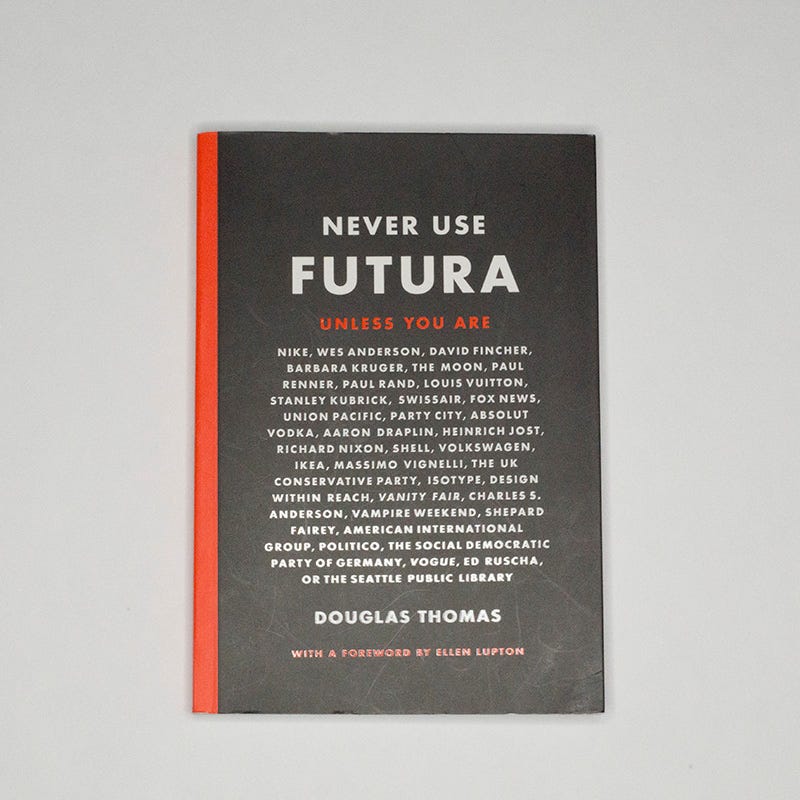
Turns out Futura “was only one of many geometric sans serifs to be designed in Germany during the 1920s and '30s” (p. 48). The book shows you what they look like. And Thomas then proceeds to outline how Futura made its way across the Atlantic, to spawn a large variety of clones, which came to dominate US design for a long time – even during World War 2, when a poster for designers suggested to “Boycott Nazi Type!” and “Encourage American Design!” (quoted from a poster reproduced on p. 57).
As a font that originated from the Bauhaus, Futura could hardly be called a Nazi type, except that it ended up being used by them after all. The Nazis shut down the Bauhaus and forced many of its members into exile. Rejecting modernism, they brought back various of the much harder to read Fraktur-style fonts (the Postdam font mentioned above is a contemporary version of such a font; Thomas uses the term “blackletter” to describe them), “propagating a far more nationalistic and inward-looking type design” (p. 69). Now get this:
“In 1941, at the height of the Nazi empire […], the government issued an abrupt, if not problematic, message of its own, signaling a deeply cynical about-face on policy: henceforth, the Nazi government would no longer use blackletter, having discovered that it was actually Jewish in origin and not German.” (p. 72)
Oh boy! Honestly, if someone had told me how much was tied to fonts alone I would probably not have believed it before reading this book.
Having established the font's birth and early life, Thomas then goes on to show how it achieved iconic status in a large number of places, oddly looking dated here (let's say in 1960s NASA brochures), still cutting-edge there (let's say in Barbara Kruger's agit-prop pieces), and pretend-nostalgic elsewhere (such as when used by Wes Anderson for The Royal Tenenbaums). The second half of the book is a bit of a hodge podge of material, some interesting, some not so much. But that's OK, because Futura has become such a huge part of our visual culture, which itself is not any less a hodge podge.
If anything, Never Use Futura re-taught me the one lesson that I enjoy re-learning: when someone writes a deeply informative and for lay persons easily readable, yet not broad or superficial book about something that I know nothing about, then there is a lot to discover. I even made Futura my default font for OpenOffice Writer now: when someone tells me not to do something, chances are I will do exactly that.

One of my cats just needed to have surgery for a growth on her neck. Thankfully, she is already a lot better. But there now is that huge bill to take care of. So I decided to do a print sale. The above image is the first image in that photobook I mentioned above (obviously without the watermark I added for Instagram use — it’s not in the book or on the print).
While I see the photobook as the work’s primary medium, I have started thinking about prints, and I settled on digital silver-gelatin prints (the piece of paper is exposed with a laser and is then developed following traditional b/w processes). There’s nothing wrong with inkjet prints, but I like these prints a lot better. They’re gorgeous objects.
For the print sale, you can get a signed 8x10” print of the picture for $100 (roughly 70% of that goes towards the vet bill, the rest covers production costs) plus shipping costs.
If this interests you, please send me an email. I’m going to collect orders until roughly the middle of February. Once I know how many prints I need to get made, I will order them from the lab and then ship them out once I receive them.
If you’re interested or for questions or comments, please send me an email!
I’m going to be off to London (UK) this week to serve as one of the jurors of MACK’s First Book Award. Feel free to be in touch about anything you’ve read above (or whatever else), but please note that once I’m traveling, my responses might arrive a day or two delayed.
Thank you for reading!
— Jörg